Color is not just a visual experience; it is deeply connected to emotions and psychology, influencing mood and behavior. When it comes to home décor and style, selecting the right paint color for each room can transform a space from merely functional to inspirational.
The right choice of paint can elevate a room’s aesthetic and enhance its purpose. Read on to delve into the science of color and receive expert tips on choosing the perfect paint tones for every room, ensuring your Alpharetta home is not only stylish but also a reflection of your desired ambiance.
Understanding Color Psychology
Color psychology is the study of hues as a determinant of human behavior. Colors can invoke specific feelings and reactions; for example, blues are often seen as calming and stabilizing, while reds are associated with energy and passion. Utilizing this understanding can dramatically affect the atmosphere of a room.
Living Room: Welcoming Warmth
The living room serves as the heart of the living environment — a place for relaxation and socializing. Warm neutrals like beige, taupe, or soft clay provide a calm, inviting backdrop that complements various design elements and personal styles. These shades promote relaxation while fostering an environment conducive to conversation.
Kitchen: Stimulating Appetites
Kitchens thrive on vibrant, inspiring colors. Shades like yellow, red, or orange can engage the appetite and enhance energy, making them ideal for this space. However, for a more modern and serene kitchen environment, consider cooler tones like soft blues and greens, which reflect cleanliness and freshness.
Bedroom: Serenity in Sleep
The bedroom is your sanctuary for rest and rejuvenation. Soft, soothing tones like lavender, pale blue, or gentle grey encourage relaxation and better sleep. These colors are known to lower the heart rate and blood pressure, ushering in a peaceful night’s sleep.
Home Office: Productivity Boost
In a home office, the choice of color should enhance focus and efficiency. Green is an excellent choice, as it is associated with growth and prosperity, and it is easy on the eyes for long periods. Alternatively, soft blues can also be calming, which helps in reducing stress during work tasks.
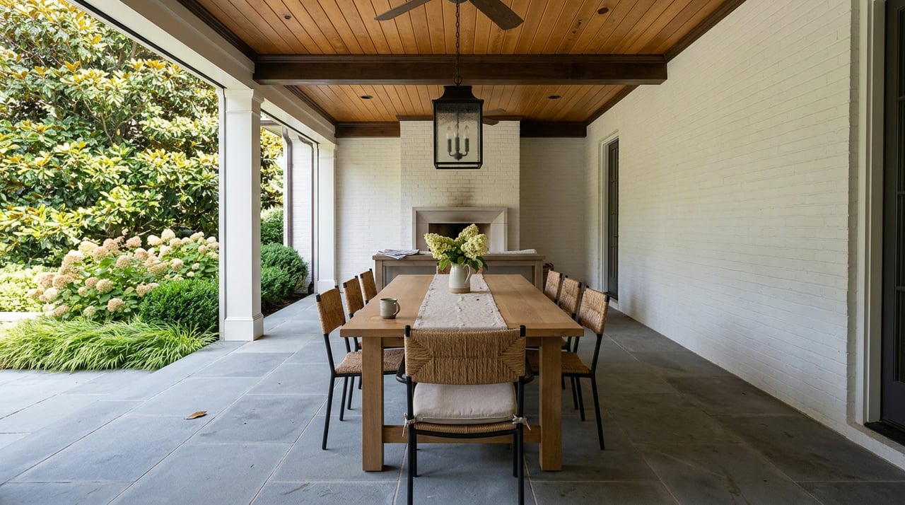
Dining Room: Rich and Royal
Dining rooms benefit from deeper, richer colors that create a luxurious and intimate dining experience. Consider deep blues, maroons, or even charcoal. These tones often encourage longer conversations and lingered meals, creating a dramatic backdrop for memorable evening dinners spent with guests.
Color-Matching Techniques
Once you understand the psychological impacts of colors, the next step is to match them effectively within your home’s color scheme. Effective color matching can enhance the overall harmony and flow of your living space.
Monochromatic Schemes
A monochromatic color scheme, or using various shades, tones, and tints within a specific hue, can unify a space while adding visual interest. This scheme is particularly effective in creating a more cohesive atmosphere, making spaces appear larger and more organized.
Analogous Schemes
This color scheme, which involves hues adjacent to each other on the color wheel, is excellent for rooms intended for relaxation and tranquility. This scheme is pleasing to the eye and ideal for achieving a peaceful and comfortable environment. It works well in rooms that are meant for relaxation.
Complementary Schemes
Utilizing colors that are opposites on the color wheel provides a dynamic and lively visual contrast, ideal for areas where energy and vibrancy are desired. This scheme is striking, with a high-contrast look, and can be used to emphasize certain architectural features or furnishings.
Triadic Schemes
A triadic color scheme uses three evenly spaced colors around the color wheel, creating an intriguing yet balanced palette. This approach is bold and creative, suitable for spaces that aim to inspire and energize.
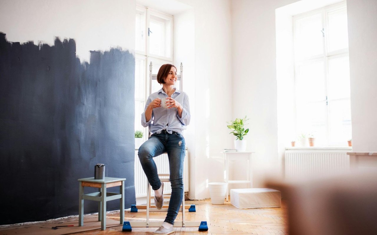
Practical Tips for Selecting Paint
Test Your Paints
Before committing to a specific color choice, always test paint swatches on large sections of your wall. Observe how the color changes in different lighting conditions throughout the day to ensure it matches your aesthetic and functional expectations.
Consider Lighting
Lighting dramatically affects how a color looks in a living space. Natural light shows the truest color, while incandescent lighting brings out warmer tones. Fluorescent lighting, on the other hand, draws out the cool tones in many colors.
Think About Finishes
The finish of the paint can affect the color’s appearance as well. Glossy finishes reflect more light and appear brighter, while matte finishes absorb light and can look richer.
In the end, choosing the right paint color for each room in your Alpharetta home can be an enriching experience that matches your personal style. By understanding the science behind the design choices and following these expert tips, you can create a harmonious home that is both beautiful and functional. Get started today in Alpharetta real estate with
Todd Kroupa.